The Toyota Prius Prime. In so many ways, a remarkable piece of engineering. Efficient, comfortable, and not so bad in the cargo territory. In it’s plugin form, it can run 20-25 miles on pure EV power, and after that, it still chugs along at 40mpg. For people wanting to dip their toes into the electric vehicle world, it’s not a bad place to start, assuming you’re okay with the styling.
With all that, what the HELL went wrong when they ‘designed’ the dashboard and the information systems?
I’m rarely speechless when it comes to engineering projects, particularly ones backed by such a well respected and successful company as Toyota. But jumpin jehosephat. Who the heck designed the dashboard? It’s… it’s… nnnnng…. well… let me show you.
The Dashboard – An Introduction
First, lets take a look at the interior. This is the 2019 Prius Prime dashboard, directly from Toyota’s brochure…
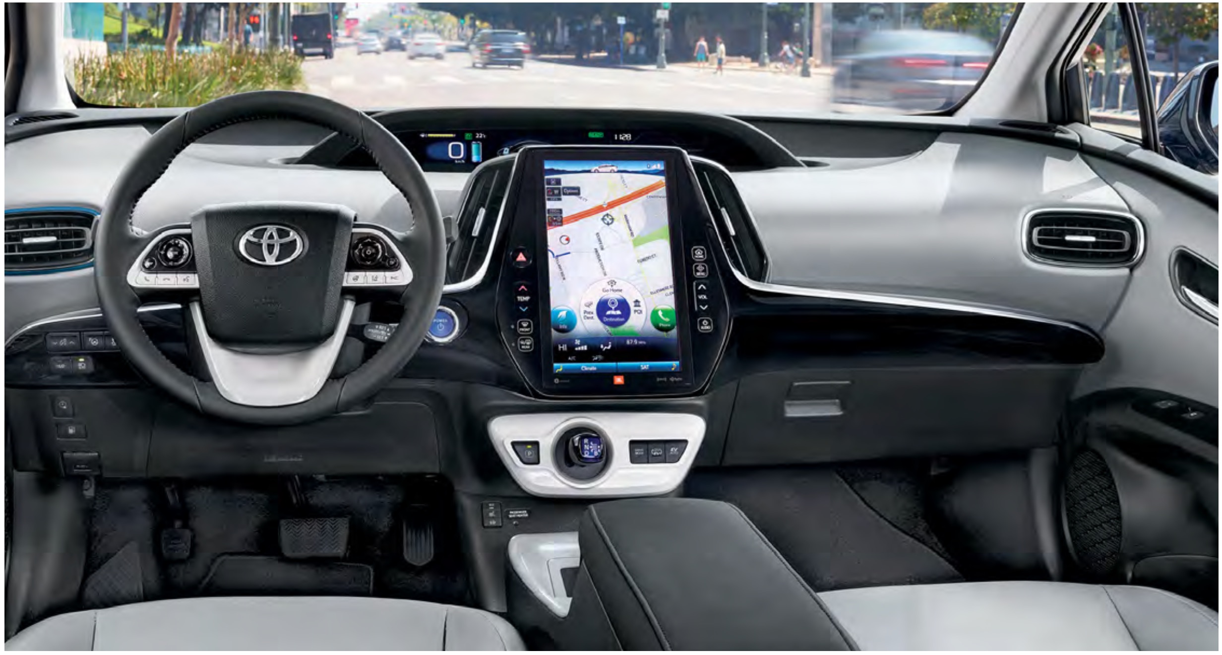
Now before I go straight to the jugular, lets note a few positive aspects here.
- A large, centrally located touchscreen. I like that. It’s easy to reach, everyone in the car can see it, it’s bright and visible.
- The steering wheel has easy to reach controls, right under the thumbs. Nice.
- The upper display (directly in front of the window) has 3 smaller screens that can show a variety of information panels. The most obvious one is a speedometer, but the other options are battery usage, mileage, map directions, etc. As compared to the Tesla, which puts everything on one display in the middle of the car, these secondary displays that ALWAYS display certain information is a nice touch.
Well, that’s nice, but what’s your beef?
Sounds all peachy so far, right? I mean, it looks all shiny and clean, so what’s wrong?
Turns out, plenty.
Lets start at the meta level. That big central display? It only controls a small subset of the car systems. It’s a bad design to have to go hunting for an external button or switch or toggle or display to get a basic function that the display should have on it.
Another problem with the central display are the buttons on the glass on either side. Those are flush contacts. You have to look at them to determine if you’re pushing them, and there’s no feedback when you do. Talk about distracted driver problems. No feedback contact buttons should be used VERY CAREFULLY in motor vehicles. Why some of these buttons are glass and others in the car are standard switches, I have no idea.
Okay, but lets hear the real fails.
Okay, you asked for it, lets start running down some absolutely batshit decisions made on this car.
- Lets start simple. Seat heaters. Everyone loves ’em, right? Took us literally googling and watching youtube videos to figure out how to turn them on. The controls for the seat heaters are tucked under the dash, on either side of the central console. Once I scrunched down in the seat, bent my head to one side, I was able to see them. My wife, who is a foot and a half shorter than I am, never saw them either. Who thought this was the appropriate placement for these switches?
- Remember those little screens under the front windshield? Nice, aren’t they? Well, they are configurable. You can change what each one shows. At some point, my wife brought up “Hey, that middle display used to show how much battery time I had left, now it doesn’t. How do you change that?” – I, a systems engineer, could absolutely not figure out how to change those displays. The answer? Tap the right arrow on the steering wheel right control pad. No other feedback that this is how to do this – no menus, no prompts, no information – I had to google this one too. There’s nothing on that nice big central display that lets you configure these smaller displays. They are completely separate.
- At one point we were driving around at night, and I was wondering why the central screen was so bright. Most cars switch into ‘night mode’ when it gets dark, but this screen was blazing white. Going through all the menus, I found a screen setting for ‘DAY MODE’ ON/OFF – what exactly that means is sort of a mystery. There was no NIGHT MODE ON/OFF. Just that one toggle. Turns out, you need to use the OTHER screen control. The one on the left side of the steering column around knee height. There’s a dial there that on older cars would set the brightness of the dashboard instruments. Some bright engineer at Toyota decided that if that little knob was spun to a certain point, the central console would always be in day mode. the DAY MODE apparently can override this setting? Who knows – but having to go off-screen to some random control when the option should have been RIGHT THERE on the screen is definitely a fail.
- Backup beeper. Did you know the Prius has a backup beeper? Going by Wikipedia :
A back-up beeper, also known as back-up alarm or vehicle motion alarm, is a device intended to warn passers-by of a vehicle moving in reverse. They typically produce 1000 Hz pure tone beeps at 97-112 decibels.[1] Matsusaburo Yamaguchi of Yamaguchi Electric Company, Japan, invented the back-up beeper. It was first manufactured as model BA1 in 1963.[2] ISO 6165 describes “audible travel alarms”, and ISO 9533 describes how to measure the performance of the alarms
Great idea, right? Except the Prius backup beeper SOUNDS INSIDE THE CAR. Not externally. You can’t hear it outside. Who exactly is this supposed to be warning? - The mapping software sucks. I mean, you just can’t get around it. It’s cumbersome, it’s painful to use, the search functions are absolute shit, and it’s just a nightmare to try and use productively. Took us another zillion years to figure out how to turn off the turn by turn navigation (you can’t except via a buried setting – makes listening to music really terrifying – why can’t you just say ‘turn off turn by turn for now, I’m listening to something cool, I don’t need the interruptions telling me that I’ll be on this interstate until the heat death of the universe.’
- Most functions are disabled while in motion. This seems to carry over from day 0 of cars getting anything more complicated than an FM stereo head unit. Someone somewhere said “We should disable any function that may be a distraction to the driver, with no option to get around it”, and so it was. But, what if you’re traveling in a modern vehicle that thoughtfully placed the navigation system between the driver and passenger seat, where the passenger has the same access as the driver, wouldn’t it make sense to allow the passe… NOPE! Locked out! You can’t modify your route or destination or settings while in motion. DENIED.
Denoument
I’m sure I’ll be adding to this list as more things come up. What’s bothersome about all this is so much of this can be fixed in software. But as far as I can tell, Toyota is following the auto manufacturer trend of assuming once a model year of a car is complete, so is the software, and it doesn’t need to change. They may do minor tweaks and fixes, but they do not actually revise the systems with major improvements (unlike Tesla, who put out major software updates pretty much constantly, frequently adding new features or overhauling others).
It may sound like I’m bashing Toyota and ignoring flaws in other manufacturers. That’s not the case at all. I’ve written in the past about my issues with the Tesla Model 3, and while I didn’t have a lot of complaints about my Chevy Volt, there were some frustrations with GM. (In fact, I had some UX problems with the Volt as well, but the Volt didnt’ have the big touchscreen that SHOULD have made those problems easy to fix.)
Modern car manufacturers absolutely need to get on board, and stop thinking of the dashboard with a touchscreen as just a ‘shiny’ version of the old knobs and dials dashboards. It’s a fully functioning digital information and control system, and should be treated as such, with regular updates, and some put into UX design. Tesla is the only company that is doing this right. What the heck is everyone else thinking?